Introduction to Network Analysis
This guide will help you:
- ☞ Visualize network data
- ☞ Measure network data
- ☞ Describe features of network data
Evaluate Data
Download network node and edge data. After downloading each file, open them in Excel and evaluate their content and structure. Use the questions below to guide evaluation.
What does the data appear to describe? When looking at the node and edge data together, what connections does it appear are being made? How does the structure of the data support these connections?
Exercise
As you progress through this guide, think about how to answer these questions:
How do different types of centrality affect your interpretation of the network?
What categories of nodes tend to broker connections in the network (hint: betweenness centrality)? What does this allow you to say about the network?
What nodes have the highest in-degree centrality, out-degree centrality, and eigenvector centrality? Do the highest ranking nodes for each type make sense given what you know about the network?
Import Data
Open Gephi and click on the 'Data Laboratory' tab at the top of the interface.Click the ‘Import Spreadsheet’ tab. Select and import the nodes data. Click the button with the ‘ . . . ‘ label to navigate to and select your first data file.In the ‘As table’ field specify the type that corresponds to the file.
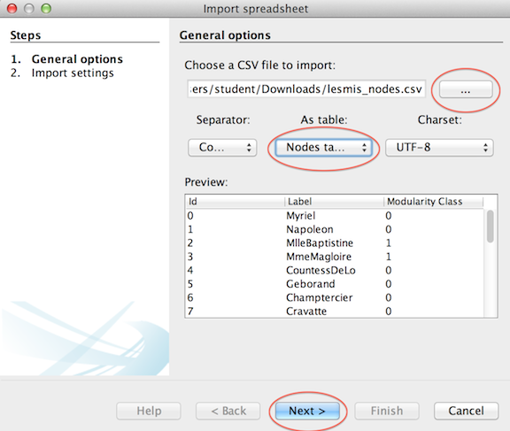
Click ‘Next’, accept default settings and click ‘Finish’. Repeat process with edges data. When the edges and nodes data are imported, they will be displayed in the ‘Data Laboratory’ window. Network metric data generated in the course of this exercise will be added to imported data.
Apply Layout
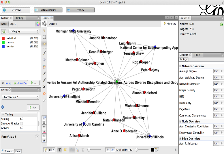
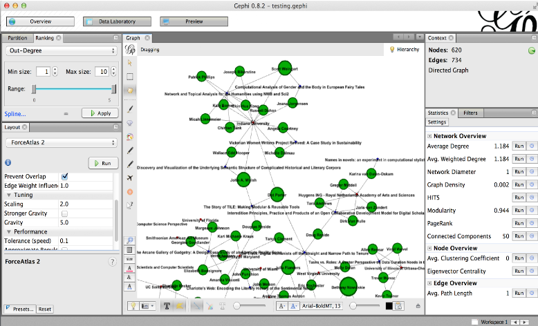
Click on the ‘Overview’ tab at the top of the screen to access functions you will use in the remainder of the exercise. You will see the imported data rendered as a network visualization in the ‘Graph’ window. As network data grows in complexity the default visualization becomes fairly useless for exploring the network.
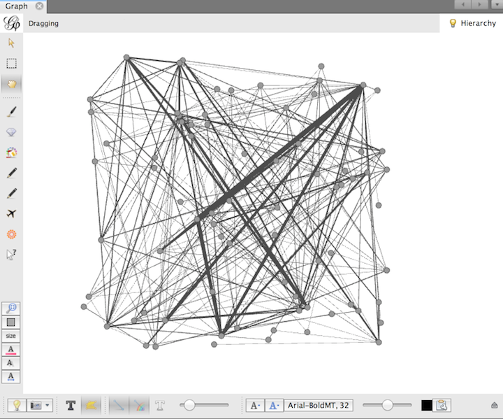
In order to better navigate the data it is possible to utilize a layout from the ‘Layout’ tab, on the left hand side of the screen, to generate a new visualization. Try experimenting with a couple of different layouts until you feel it is easier to interpret the network (e.x. clusters are distinct, nodes do not overlap). Note that each layout has additional features that can be leveraged in the Layout section of the interface.
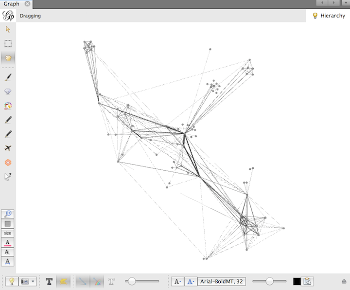
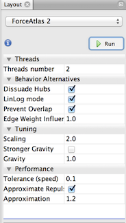
Example Layout - Force Atlas 2
Adjust Nodes
We want to distinguish between the people, sessions, and locations in our data. To recolor according to these categories, select the ‘Partition’ tab in the top left corner of the Overview panel, and then the ‘Nodes’ tab located just below that. If a drop down menu does not appear, you may need to click the refresh (green arrows) button. The dropdown should consist of ‘Category’ and ‘Type,’ the two categorical metadata fields in the data we uploaded. Select ‘Category’ and hit the ‘Apply’ button. You should see the nodes re-colored according to category. You will probably also want to turn the node labels on. The node label toggle switch is the dark-colored ‘T’ near the bottom left corner of the Graph section. You can adjust the text size either by clicking on the font button along the bottom or by moving the rightmost slider left and right to increase and decrease the size. Label color can be adjusted to the right of the slider.
Measure
On the right side of the interface, under the ‘Statistics’ tab, you’ll find a Network Overview menu with a number of metrics listed. These metrics are helpful for analyzing the graph, and for visualizing the graph in different ways. Click ‘Run’ next to a metric to generate a data report window. The measurement for the entire graph will appear in the Network Overview, and the measurement for each node will be also be added to the Data Laboratory. To answer the questions posed earlier, we will be working with the Eigenvector (run this as an undirected network), and Average Degree metrics, but feel free to run several or all of them for comparison.
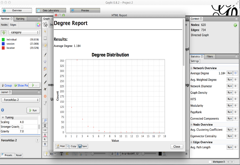
Average Degree - The average number of edges connected to a node Avg. Weighted Degree - The average sum of the weights of edges connected to a node Network Diameter - The longest shortest path between nodes within the graph Graph Density - Measures how close the graph is to complete HITS - Computes two values for each node; How valuable information stored at that node is & the quality of the nodes links Modularity - Community detection algorithm PageRank - Ranks nodes “pages” according to how often a user following links will non-randomly reach the node “page” Connected Components - Determines the number of connected components in the network Avg. Clustering Coefficient - Averages how nodes are embedded in their neighborhood Eigenvector Centrality - A measure of node importance in a network based on a node’s connections; the sum of the centrality measures of all nodes connected to a node Avg. Path Length - The average number of steps to get from one randomly selected node to another
Utilize Measurement
Once you’ve generated metrics, you can apply them to the graph visualization. Return to the left sidebar and click on the ‘Ranking’ tab, and then click the ‘Nodes’ tab just below it. Notice the icons to the right of the ‘Nodes’ and ‘Edges’ tab -- they allow you to resize and recolor both the nodes and the node labels. We’ll want to select the red diamond - the node size option. Select ‘Eigenvector Centrality’ from the drop down menu and click ‘Apply.' You may need to adjust the maximum size to better show the distribution and differences in the metric. If you stopped the ‘Layout’ algorithm, you may want to run it again with the ‘Prevent Overlap’ option selected, as resizing may have created more overlaps. We ran the Eigenvector Centrality metric that treated the network as undirected, so well-connected communities of practice, including locations and panels that function within the communities, should be highlighted.
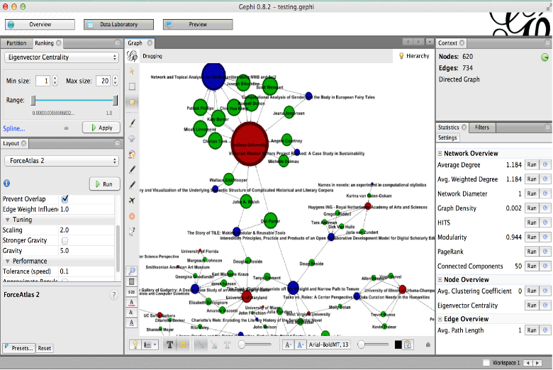
As a comparison, go back to the dropdown menu, select ‘Out-Degree,’ and click ‘Apply.’ In this directed dataset, ‘Individuals’ connect out to ‘Locations’ and ‘Sessions,’ so ‘Out-Degree’ will highlight the individuals who are associated with the most locations and sessions. Again, you may want to adjust the max size and re-run the layout.
Try resizing nodes based on different metrics to get a feel for the kinds of visualizations you can create based on these statistics.
Share Visualization
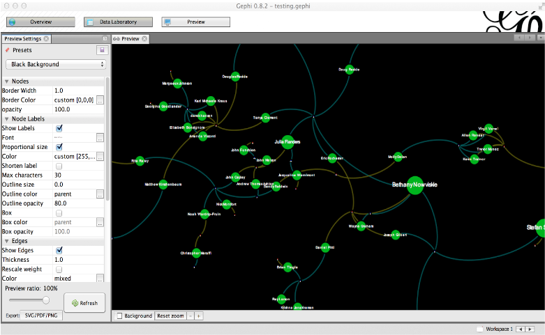
Before sharing your visualization, you may want to change the appearance of your graph. The ‘Preview’ window includes a number of options to improve the aesthetics of the graph. Click the ‘Refresh’ button to bring your graph into the window, and use the controls along the left side to make changes. The presets are good places to start, but you may need to tweak things from there. Changes will not be made automatically -- you must use the ‘Refresh’ button.
To manually reposition nodes, you will need to return to the ‘Overview’ window, make sure that the Layout algorithm is turned off, select the ‘Dragging’ tool (the hand icon along the left side of the graph window), and click and drag a node to reposition it.
You can export an image (SVG, PDF, or PNG) of the entire graph using the button in the bottom left corner, and use an editor such as Inkscape or Illustrator to add a title, add a legend, or crop the image. You can also save the all workspaces as a .gephi file, and you will be able to return to the workspaces as you left them. You can also export a single graph file by selecting File->Export->Graph File and saving the file as.gefx, although some aesthetic changes will be lost. More information about file support is available on the Gephi website.